
An In-Depth Look At 10 Iconic Car Logos, Their Genesis And Their Evolution

Last year, Jaguar and Mazda presented updated versions of their respective logos. Jaguar went with a “seamless blend of upper and lower case” in a far-too-subtle nod to the British marque’s upcoming all-electric era, while Mazda went with a more understated approach for ‘Flying M’ as the Japanese marque looks to increase its global reach. This may seem trite given each brand’s larger-scale plans. But make no mistake, a timeless logo is absolutely vital for any automaker looking to make its mark.
Take Longbow and Perseus, for example. Two new start-ups from Britain are keen to get on the EV map in the coming years, but while the former was quick to present its Jaguar E-Type-inspired Speedster, the latter is keeping the look of their “pre-eminent Italian design house” very close to its chest. Both, however, ensured their new logos were front and center on their press materials: Longbow’s paid tribute to Britain’s ‘Warrior Queen’ Bodica and her arcing weapon of choice, while Perseus instead went for a salubrious ‘P’ in motion rather than dig deep into the Greek mythology drawer. Two bold looks and only time will tell if someday they join the pantheon of motoring’s greatest-ever logos.
To provide the most relevant and accurate information possible, this list was compiled using data and history sourced from each manufacturer.
Related
Maserati’s Hopes To Be Profitable This Year, But It Won’t Be Easy, Says CEO
After a tumultuous 2024, the Italian luxury sports car automaker recognizes the big hurdles ahead to return to profitability.
10
Maserati’s ‘Trident’
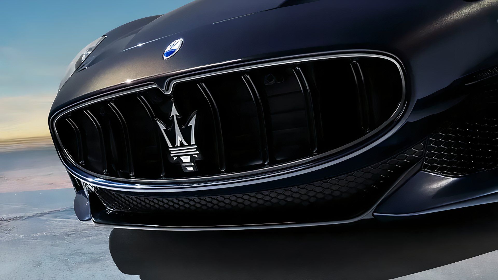
While his four brothers concentrated their efforts on their family’s first ground-up race car – the Tipo 26 – it was little brother Mario, a Brera Academy art student with no particular interest in cars, who designed the famous ‘Trident.’ Inspired no less by a statue of Neptune, god of the sea, in Bologna’s main piazza. Or the Marquis Diego de Sterlich, a family friend and future customer, came up with the idea six years earlier. Maserati’s a little fuzzy on the details. Either way: ‘power? ‘authority’ ‘tamer of horses?’ Tick, tick, and tick.
The centerpiece of a silver, rectangular badge in 1926, Maserati’s Trident has been enclosed in a “perfect oval” since 1933, and barring only the latest monochrome iterations introduced in 2015 and 2020, has boasted the primary red and blue of Bologna.
9
Chevrolet’s ‘Bowtie’
Like Maserati, nobody’s absolutely sure where Chevy’s ‘Bowtie’ originated. The Chevrolet Story, published in 1961, states that company founder William ‘Billy’ Durant tore the design, quite literally, from the wall of his Parisian hotel room in 1908, while Durant’s daughter, in her 1929 biography, states the bowtie was one of hundreds her father idly drew at the kitchen table. Many, meanwhile, believe company co-founder, namesake, and Swiss-born Louis Chevrolet was simply paying tribute to Switzerland’s Schweizerfahne.
Whatever the genesis, Chevy’s bowtie is a classic case of ‘if it ain’t broke, don’t fix it.’ The ‘Chevrolet’ wording, in the center since 1913, was removed altogether in the 1930s, and aside from the intervening wing (1947) and Cadillac-esque crest (1955), the bowtie has been modernized but gone largely unchanged since 1969!
8
Aston Martin’s Wings
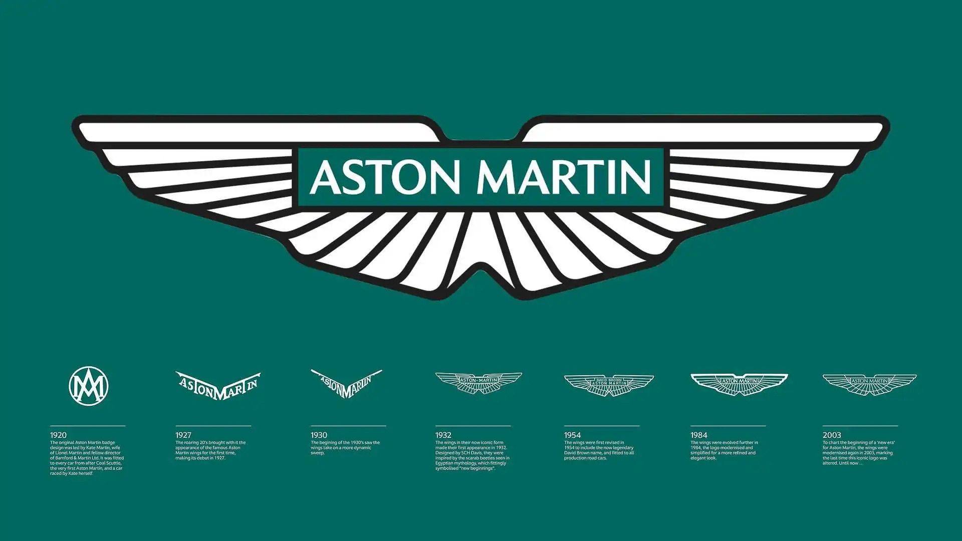
Pipping the lopsided feathers of fellow British luxury marque Bentley, Aston Martin makes the top 10, as its homogenous wings were such a radical departure from the original logo when it debuted with the ‘LM1’ in 1932. Designed by the then-editor of Autocar, Sammy Davis, to signify ‘new beginnings,’ the feathered wings were heavily inspired by an Egyptian scarab beetle!
The company name was also inscribed elegantly in the middle rather than along the length of the wings themselves (1927-1932). New owner David Brown’s name was incorporated between 1954 and 1972, and while modernized alternatives followed in 1984, 2003 and 2022, Davis’ 1932 ‘wings’ have remained a prevalent part of Aston Martin for 93 years now. A long, long way from the interlocking ‘A’ and ‘M’ with which the brand debuted in 1920.
7
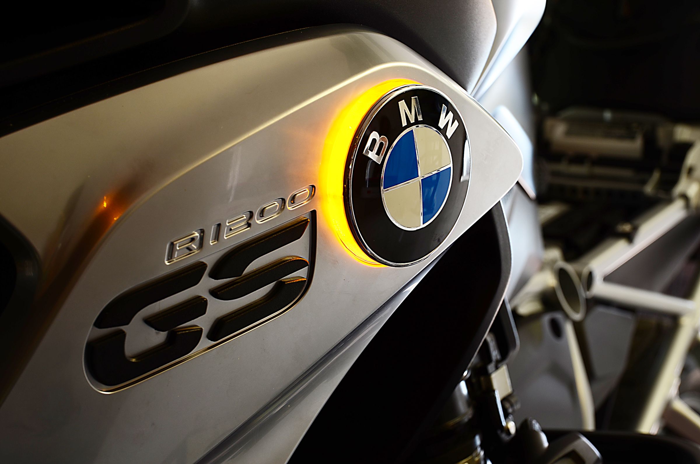
BMW’s Roundel
Yes, BMW started life as airplane manufacturer ‘Rapp Motorenwerke’ in 1913. And no, the roundel was not inspired by an aircraft propeller. Indeed, while it retained the black surround of its ‘Rapp’ forebear (the black horse centerpiece was binned), Bayerische Motoren Werke’s new logo only debuted after the company’s name and direction change in 1917. The Bayern Flugmotoren cover, meanwhile, which featured the roundel as an airplane propeller, didn’t go to print until 1918, and the blue and white checker, as it still does today, instead pays tribute to Bavaria’s national colors.
The gold ‘B,’ ‘M’, and ‘W’ lettering, made more prominent in 1933, changed to white in 1953, and an embossed look arrived in 1997, but the black surround was only retired when a simpler design, “better suited to the digital age,” arrived in 2020.
6
Alfa Romeo’s ‘Visconti’ Crest
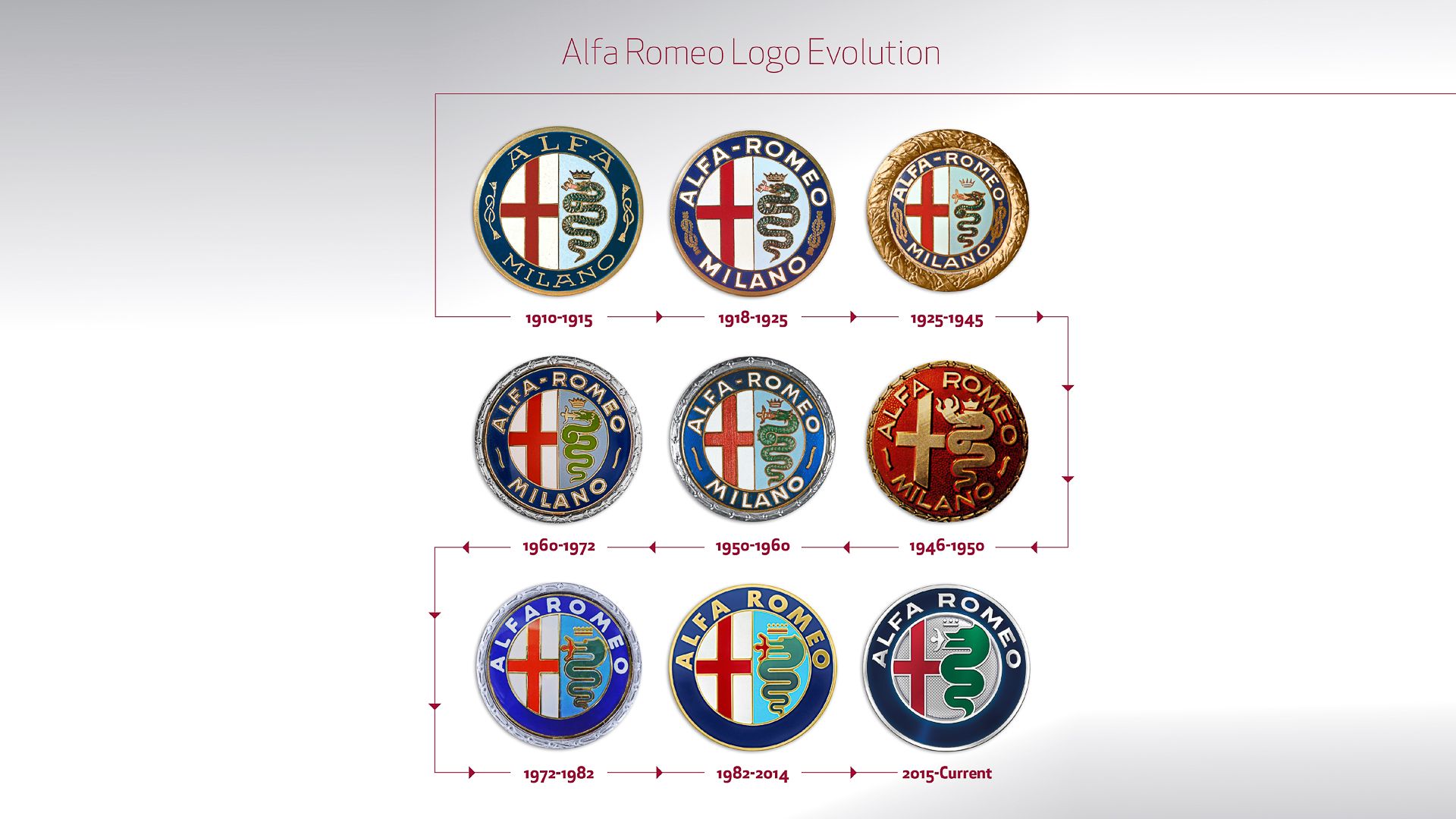
Much like BMW’s roundel, Alfa Romeo’s crest has changed very little over the last 115 years. Well, save the all-red ‘Spartan’ example introduced in 1946 when Alfa’s pressing machines were destroyed during the war. Everyone hated it, and full color was restored in 1950.
The original A.L.F.A. logo (Anonima Lombarda Fabbrica Automobili) debuted in June 1910, and paid tribute to its hometown with the cross of ‘Milano,’ the ‘Biscione Visconteo’ snake – an homage to Milan’s Visconti ruling family between 1277 and 1447 – and two ‘Savoy’ dynasty knots (the latter were replaced with wavy lines in the post-war Republican Italy before being removed altogether in 1972). New owner, Nicola Romeo, had his surname added in 1915, and a coronet celebrating Alfa’s first-ever motor racing World Championship arrived in 1925, but that too was replaced by a gold surround in 1982. 33 years later, new owner FCA commissioned a more modern and “harmonized” logo, one in which Milan’s cross and Visconteo snake were interlinked for the first time.
5
Lamborghini’s Raging Bull
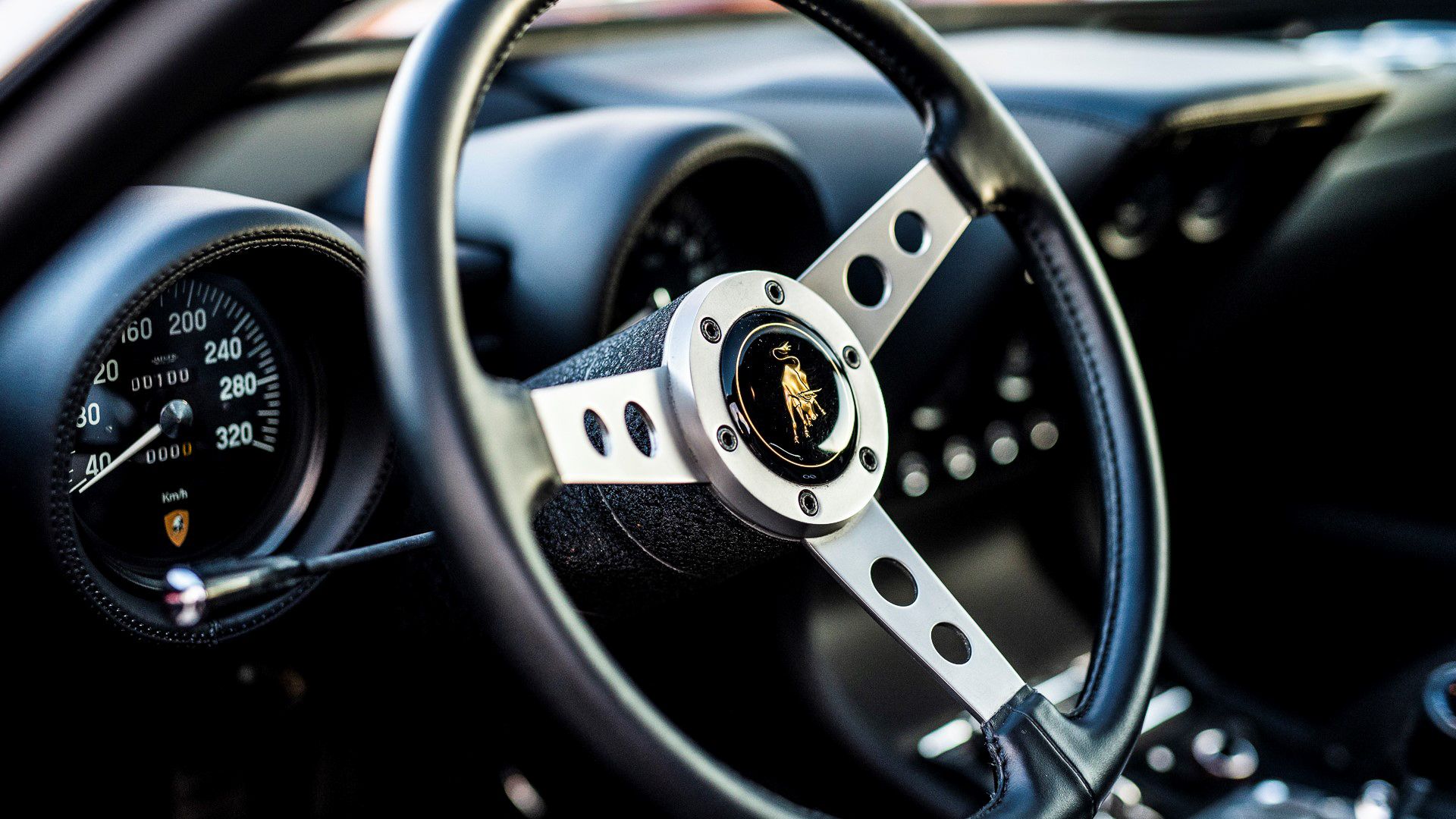
It may be synonymous with supercars today, but the ‘Raging Bull’ we know, love, and will occasionally see on pickleball paddles didn’t debut until 1963, 15 years after Ferruccio Lamborghini set up shop building tractors. Early on, ‘Lamborghini Trattori’ boasted a rustic triangle logo, split into three quadrants with a single letter apiece: ‘F’ (Ferrucio), ‘L’ (Lamborghini), and ‘C’ (Pieve di Cento, the brand’s first home). Only when ‘Automobili Lamborghini’ was born in 1963 did the golden Raging Bull finally arrive. And even then, it was another nine years before the red triangular crest changed to black.
Interestingly, though the aforementioned toro bravo is in a fighting ‘power’ stance, long-considered a coded message ahead of the Ferrari-baiting, Miura P400’s arrival in 1966, it was primarily chosen because Snr. Ferrucio was a Taurus!
Related
Audi Says Goodbye To Its Iconic Four Rings With New E Concept And Branding In China
The new concept took a bow at a private event in Shanghai and previews the company’s latest branding direction.
4
Audi’s Four Rings
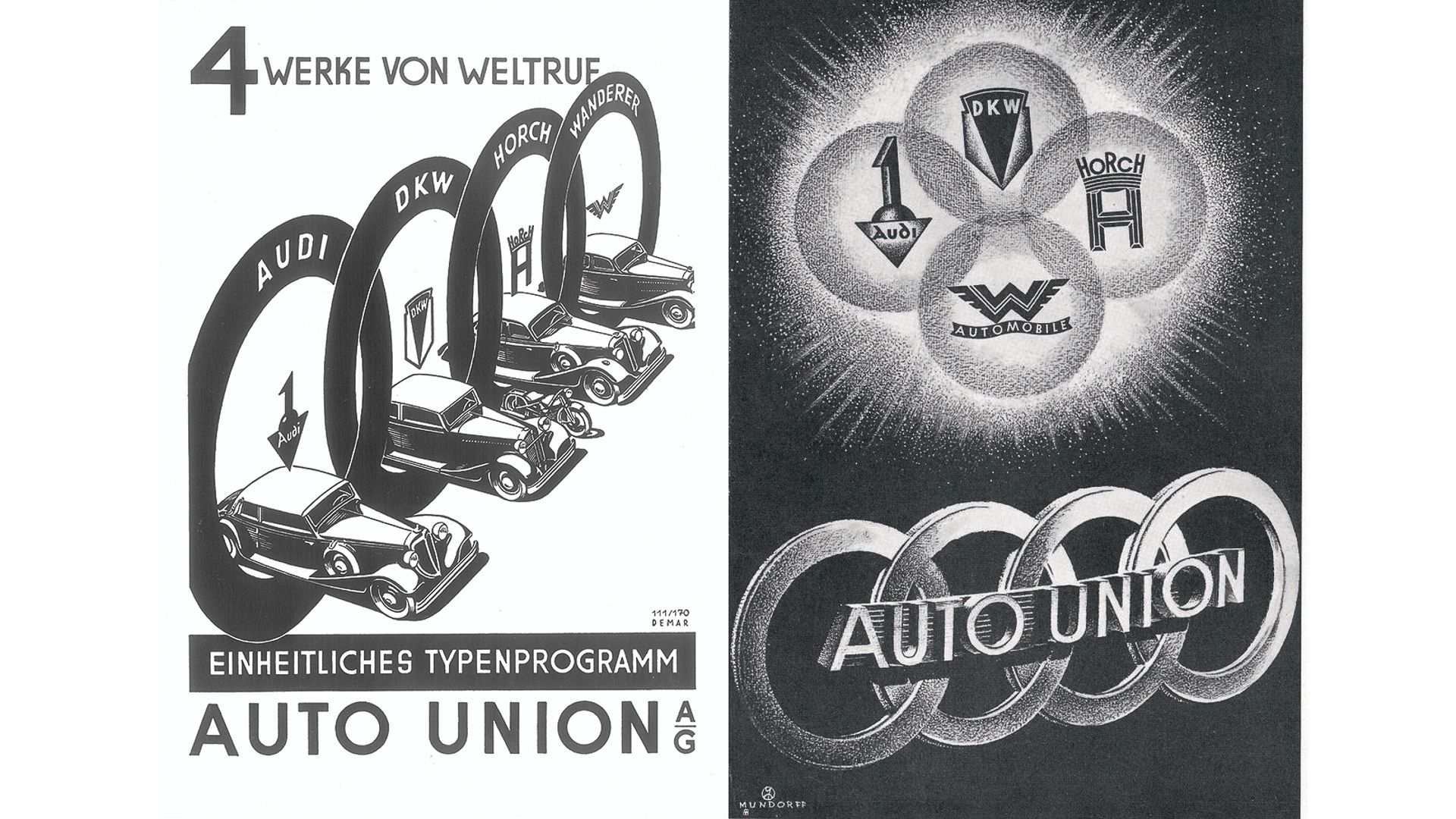
The story behind Audi’s famous ‘rings’ is the most complicated on this list, so bear with us. Having founded his first, eponymous car company in 1899, August Horch created his second in 1909 following disputes with his board members. Unable to use his now trademarked name, Horch went with the Latin translation of ‘Listen!’ – Horch! – to form ‘Audi.’ And no, the interlocked rings don’t even make an appearance here, Horch opting at first for an inverted triangle with a combative ‘1’ on top.
Unable to use his now trademarked name, Horch went with the Latin translation of ‘Listen!’ – Horch! – to form ‘Audi.’
Only in 1932, when Audi, DKW, Wanderer, and the original Horch merged to become ‘Auto Union’ did the four rings, each representing a founding member, finally debut. Trust us, that really is the bare-bones version. There are three decades to go before Volkswagen arrives, and 53 years before the ‘Audi AG’ name change!
3
Volkswagen’s ‘VW’
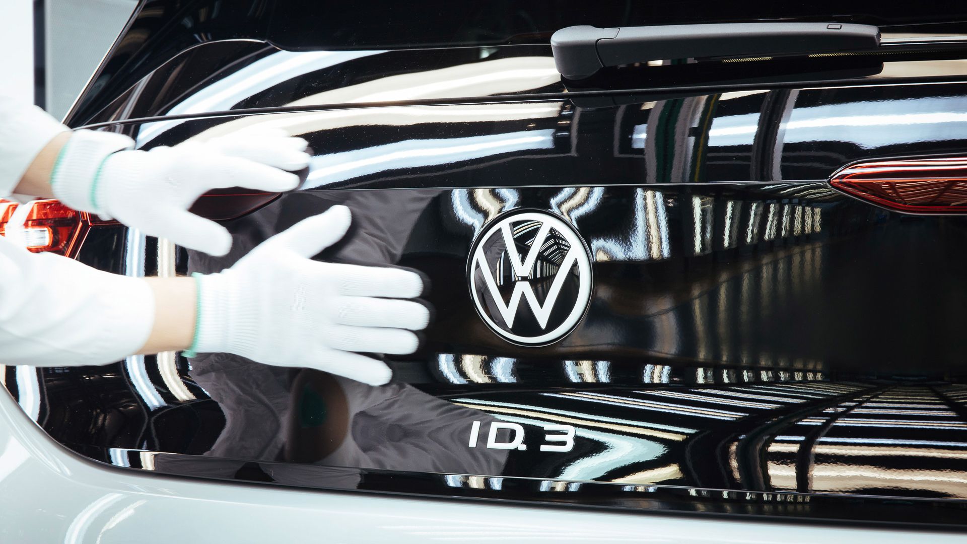
Speaking of Volkswagen, Germany’s biggest carmaker has had only nine official variants of its logo since 1937, the most recent – and simplest – of which landed in 2019. First unveiled inside a cogwheel to represent the “people’s car” (‘Volks Wagen’) and help motorize the citizens of Nazi Germany (moving swiftly on…), the ‘Iron Cross’ reference, thankfully, was gone when the redesign landed in 1939 (the cog was also ditched after the war).
A significantly larger ‘VW’ took center stage when U.S. sales began, slowly, in 1949, where it has remained ever since. The seminal Beetle helped make the ‘white-on-black’ design the longest-serving to-date (1947-1960), and it has since been evoked by ‘friendly’ lighter blue alternatives (1967 and again in 1989), and even 3D ‘punch ups’ (2000 and 2012). There’s also the 1960 ‘square’ logo, but nobody wants to talk about that.
2
Mustang’s… cougar…?
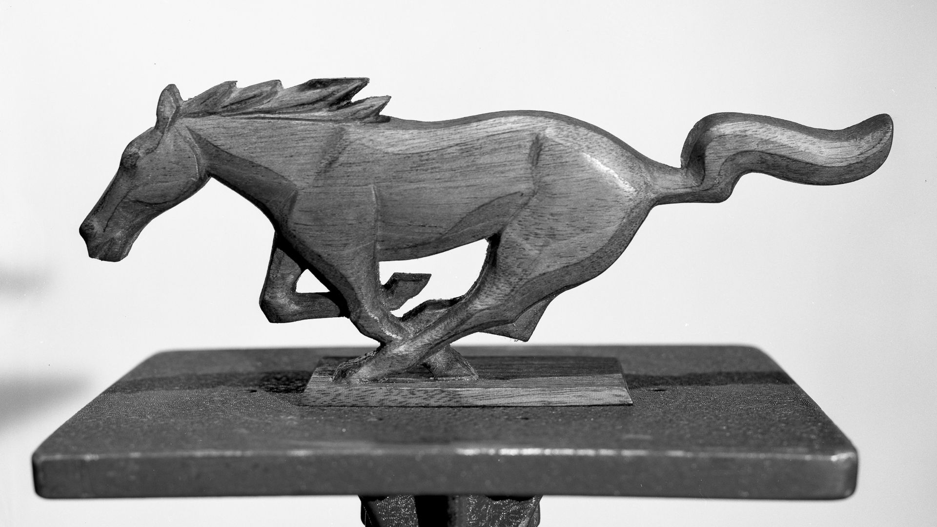
Ford’s famous ‘Blue Oval’ dates back to 1927, based on a spherical design the company first adopted in 1917. But that’s not what we want to talk about. Firstly, Phil Clark’s ‘Mustang’ logo debuted not on the first-generation Mustang pony car but on the ‘Mustang 1 Concept’ (nope, rear-engined, speedster, different model) in 1962.
Ironically, when the actual concept of Ford’s most famous sports car was unveiled – also in 1962, to further confuse matters – the logo on its front grille was a cougar, in keeping with the adopted name of the pre-launch model. Ford execs eventually went with the ‘Mustang’ name for its new sports coupe, and, after several abortive attempts to use a chess piece-like horse’s head for the logo, Clark’s altered design, always facing left and always depicted as running, got the green light for 1964.
Related
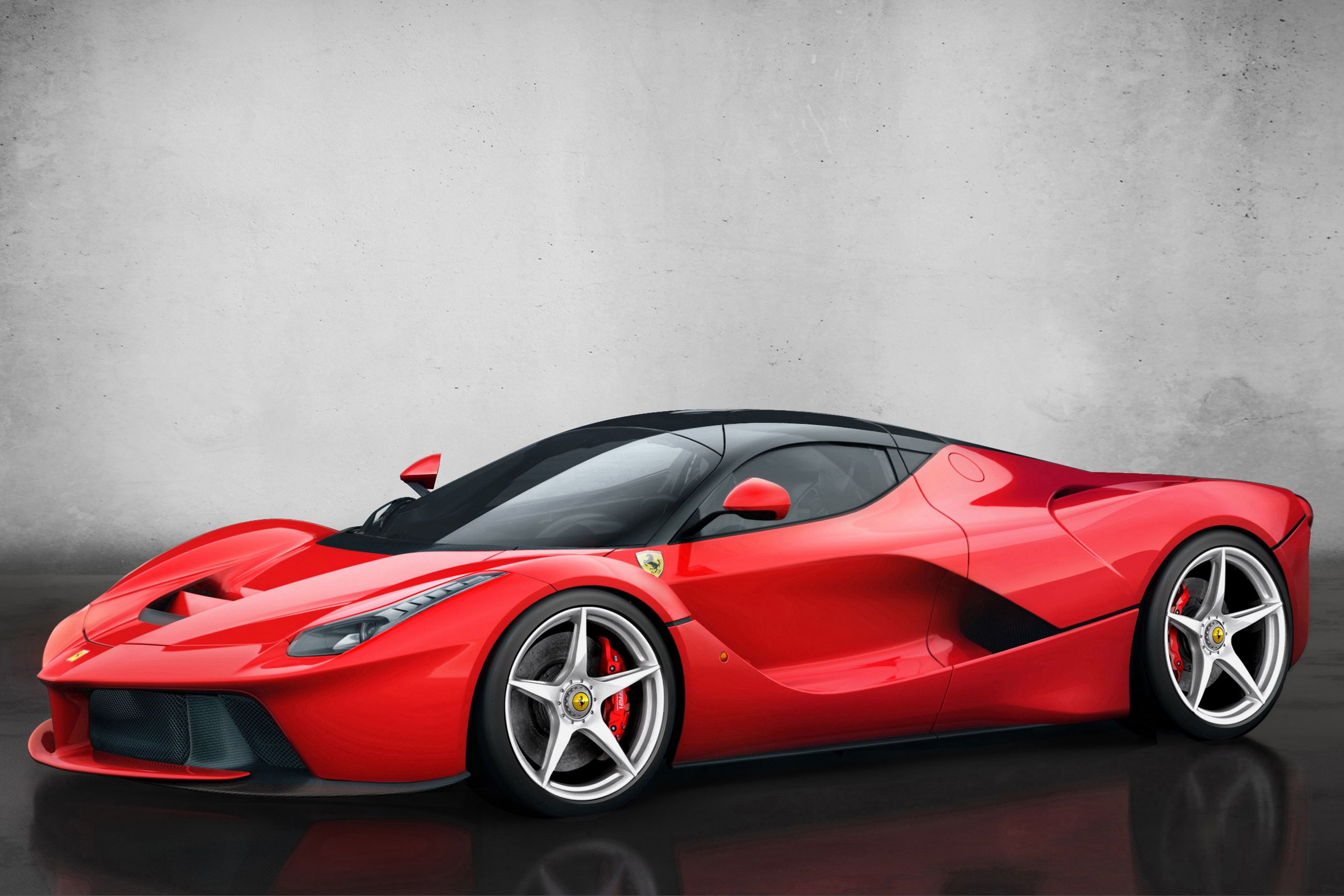
The 10 Best Ferraris Of All Time
From classics to current exotics, Maranello has a long and rich history of performance car excellence
1
Ferrari’s Prancing Horse
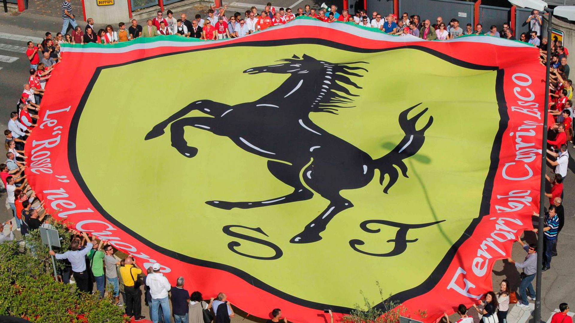
There is, however, only one prancing horse. A symbol that transcends the automotive world and is among the most famous logos on the planet. And, but for a chance encounter between a then-25-year-old Enzo Ferrari, and Count Enrico Baracca and Countess Paolina, the union may never have been.
Parents to Italian flying ace Francesco Baracca, who tragically died in action in 1918, the Count and Countess suggested to Ferrari in 1923 that he adopt the famous ‘Cavallino Rampante,’ a staple on Baracca’s airplane fuselage and used by the Italian cavalry as early as 1692, for luck. Humbled, Ferrari agreed, and on its debut at the Spa 24 Hours in 1932, the prancing horse won, comfortably. There was no going back, and in 1947, the famous stallion, its white background replaced with canary yellow in tribute to Modena, was on the nose of the first-ever ‘Ferrari,’ the 125 S. No Ferrari has been unveiled without it since then.
Source link